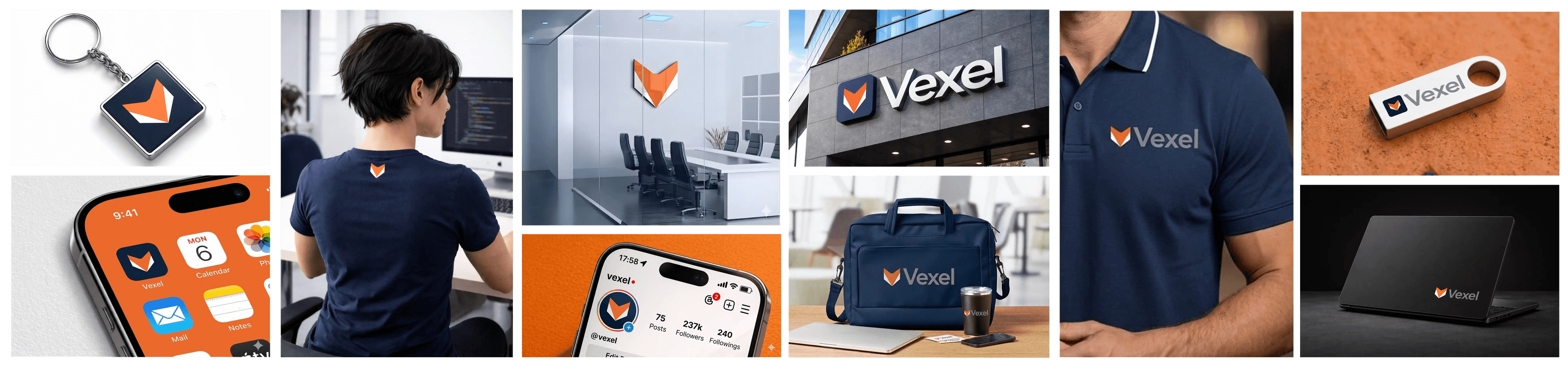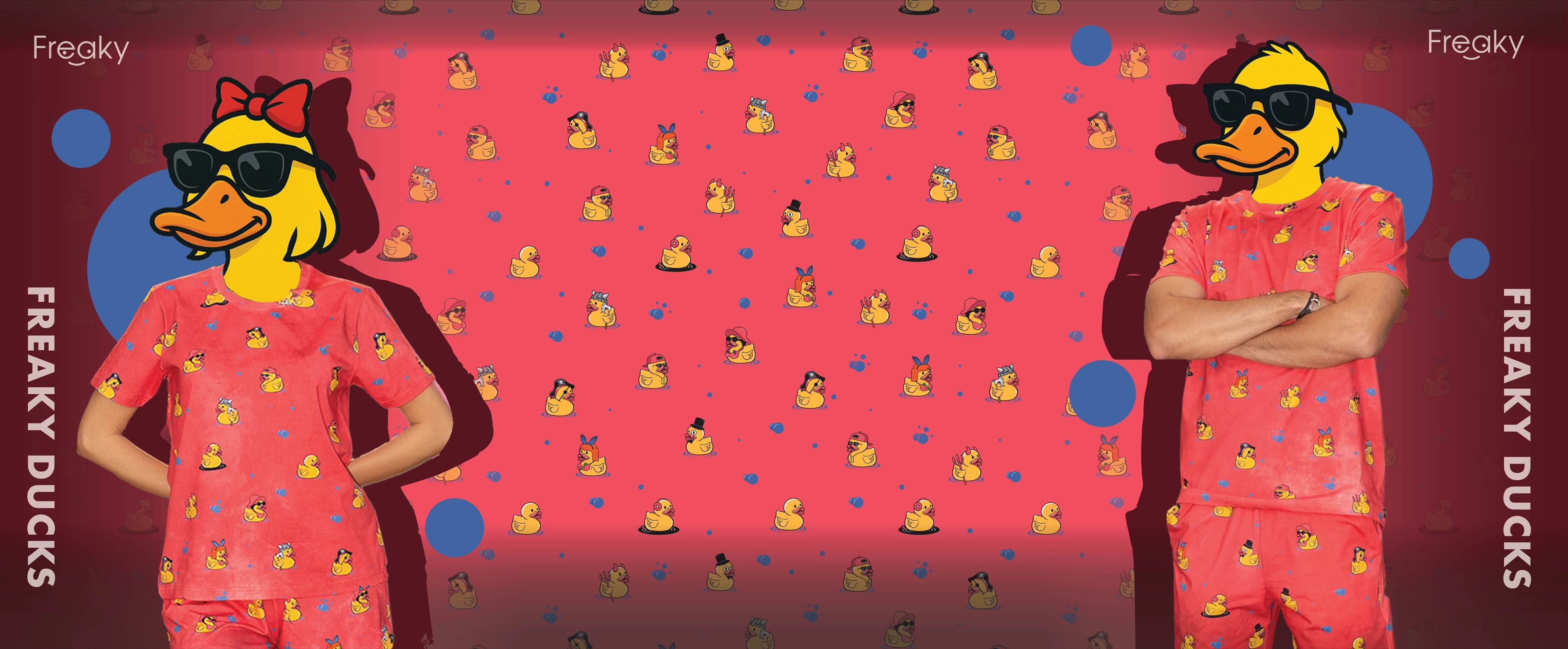

Brand Identity, Vending & Hospitality
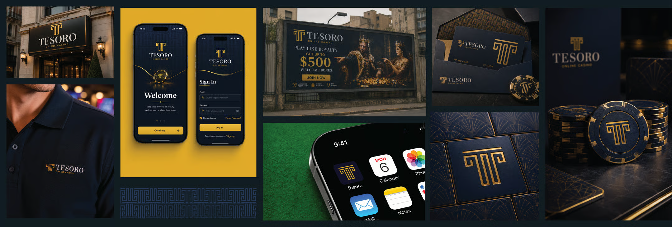
Tesoro means “treasure” in Italian. It is a premium online casino built on a single promise: play like royalty. Deep navy and regal gold set a tone of trust, prestige and high-stakes excitement, carried through a fast, modern experience across web and mobile.
From a $500 welcome bonus to live wins rolling in real time, every screen is crafted to feel exclusive, generous, and unmistakably Tesoro. This guide documents how that identity holds together through its logo, color, typography and pattern, all working as one system across the product and its marketing.
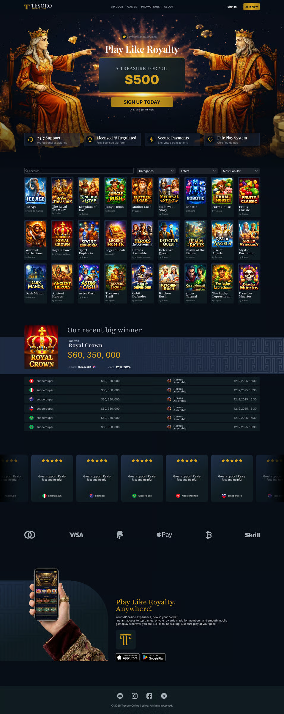
The full landing page brings the identity together in context, with type, color, logo and pattern working as one across the live casino experience.
The horizontal logo is the primary wide version of the brand identity and works best in landscape spaces where the symbol and wordmark need to remain clear, balanced, and easy to read.

The vertical logo is the primary stacked version of the brand identity. It works best in square or portrait spaces where the symbol and wordmark need a balanced, centered layout.

The icon is the compact symbol of the brand identity and works best in small spaces such as app icons, social media profiles, favicons, and other places where the full logo may not fit.

The color palette defines the visual tone of the identity and should be used consistently across digital and printed materials to keep the brand recognizable and balanced.
Main
Main
#D7A529
Alternative
#070D18
White
#FFFFFF
Other Colors
Dark Blue
#101B22
Blue
#253555
Dark Gold
#A47C18
Silver
#A4ACB8
Gradients
Gold Gradient
#D7A529 → #A47C18
Dark Gradient
#070D18 → #101B22 → #253555
Two typefaces, used consistently across headline and body, keep the brand legible and unmistakably itself at any size.
Font Style
Headline
Playfair Display
Aa
Body
Inter
Aa
Font Sizes
The brand pattern is a supporting graphic built from the identity's core shapes and colors, used to add texture and recognition across backgrounds, packaging, and marketing materials.

Delivered to Lorenzo Moretti, Founder of Tesoro, Milan, Italy.
Crafted with
More work