Mission
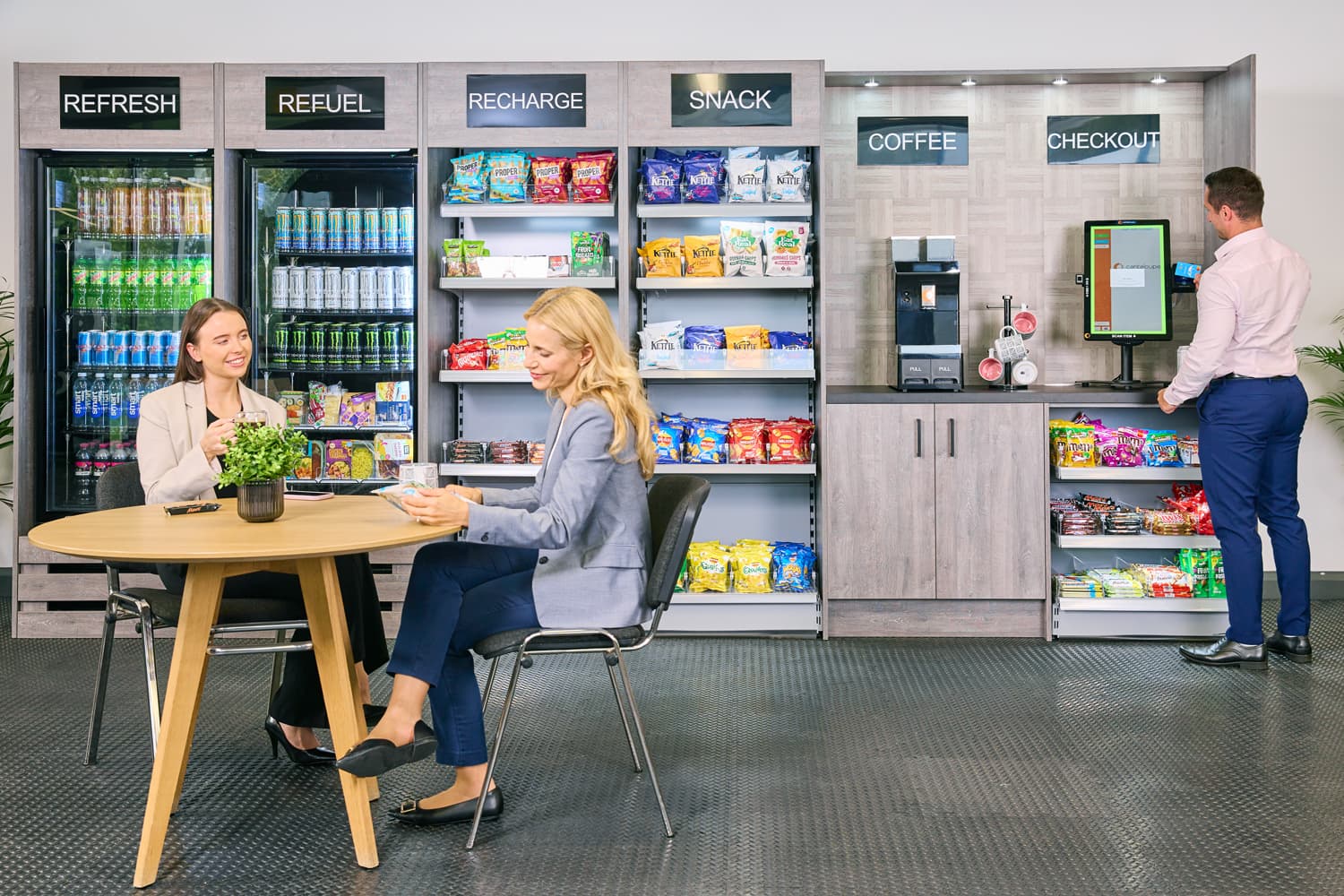
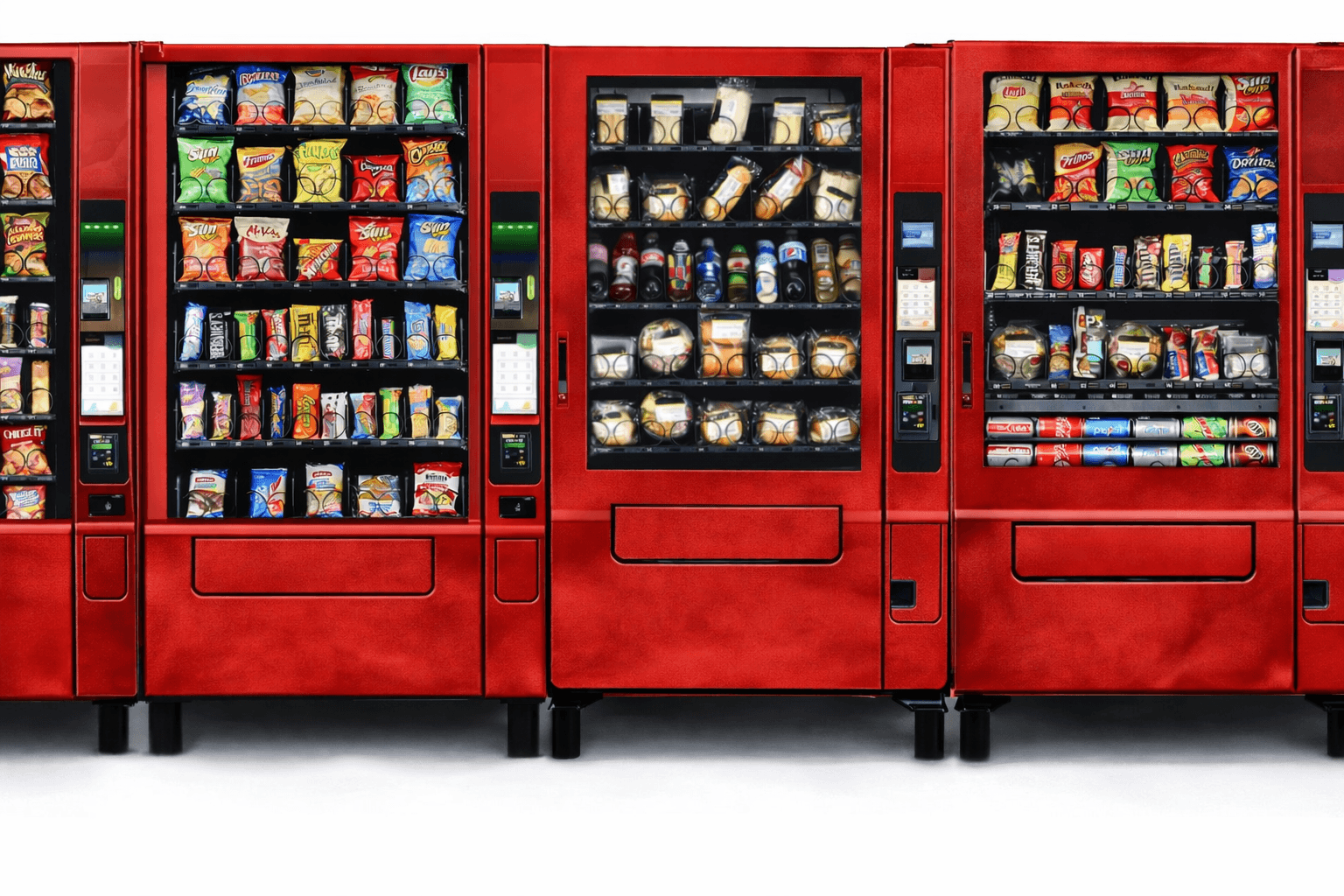
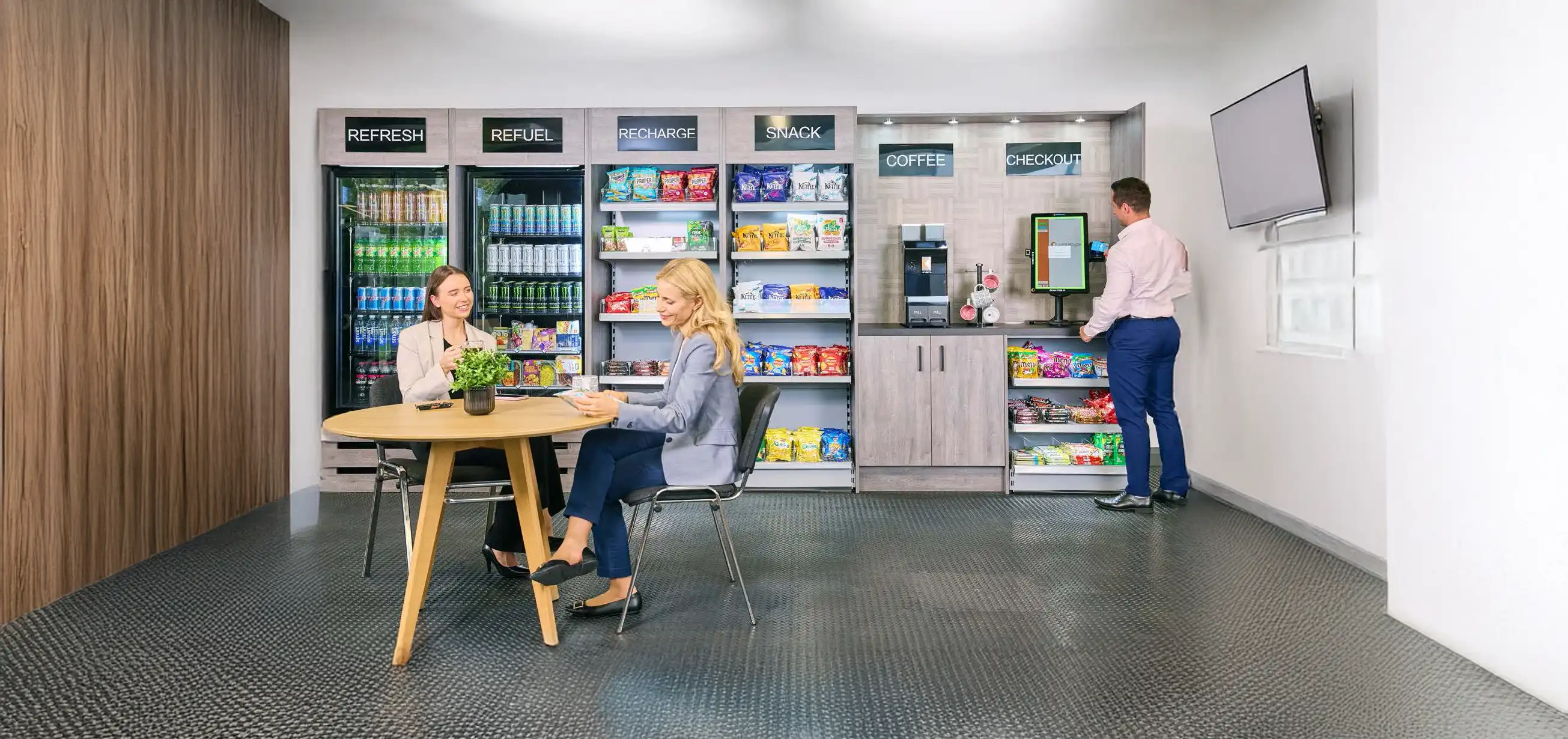
Make snacks, drinks and fresh coffee easy to access wherever people work, study, train or gather, backed by reliable local support.
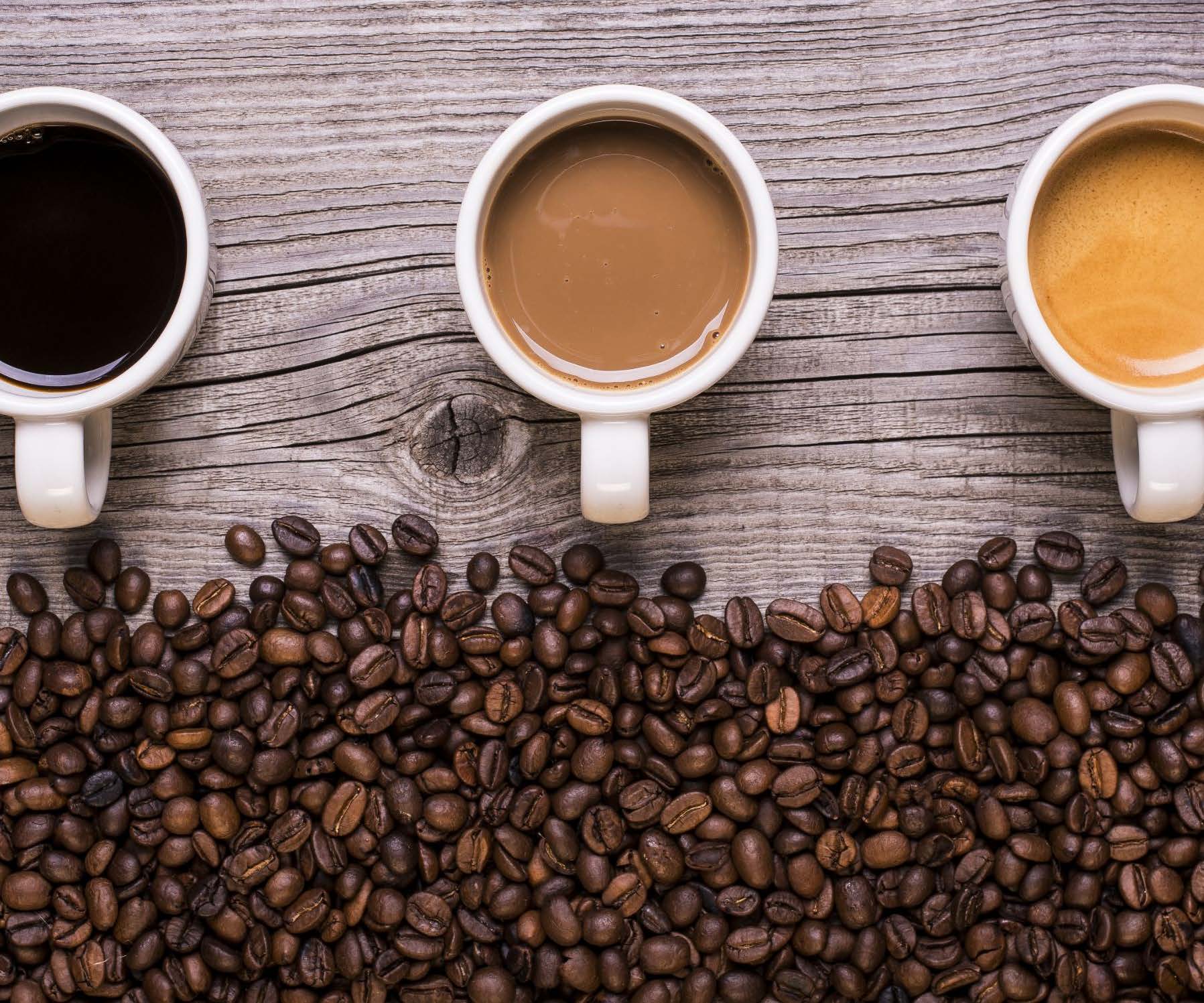
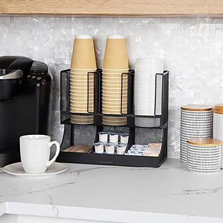
Gmunchies supplies snacks, drinks, coffee and self-service markets across the Rio Grande Valley. The brief was to give an everyday utility the warmth and personality needed to stand apart.
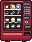
The answer began with a vending-machine mascot and the line “Press, Munch, Smile.” Burgundy, yellow and rounded illustration then shaped a flexible toolkit for signage, print, photography and digital use.
Mission
Make snacks, drinks and fresh coffee easy to access wherever people work, study, train or gather, backed by reliable local support.
Vision
Set a new regional standard for unattended retail, where convenience feels thoughtful and every break is a little better.
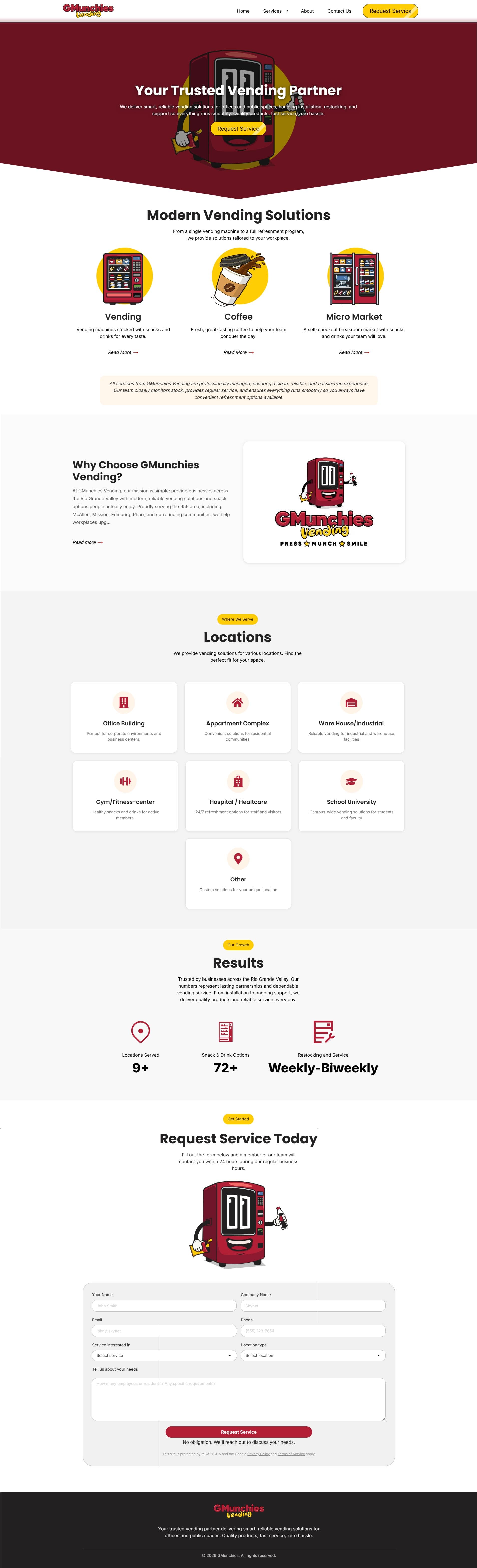
Built as the main sales and information hub, the site explains each offer, shows where it fits and gives prospective clients a direct route to request service.
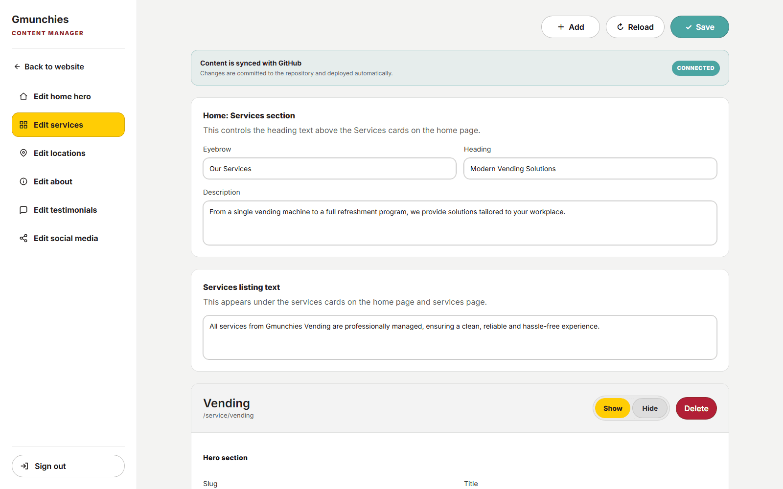
Behind it, a custom dashboard gives the team control over copy, media, locations and testimonials. Each update is committed to GitHub and automatically readied for deployment.
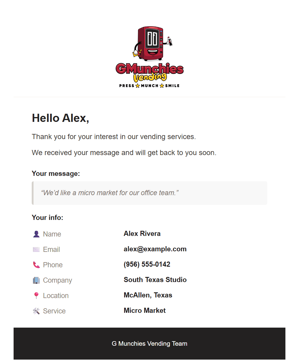
After a request is submitted, the confirmation email summarizes the details and sets clear expectations for what happens next. Its calm hierarchy and concise sign-off turn a routine message into a reassuring handoff.
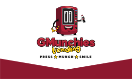
The wide lockup combines the mascot, a Gilroy-based wordmark and the “Press, Munch, Smile” signature. Gilroy appears only inside the logo, preserving its distinct character while other typefaces handle communication.

For square and portrait placements, the elements stack into a compact badge that holds together on signage, social profiles and narrow formats.

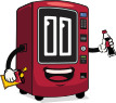
More than a symbol, the smiling machine gives the company a recognizable face. It can welcome people, carry products or appear alone when the full lockup would be too large.
Burgundy brings appetite and confidence, while yellow adds energy at key moments. Cream softens the contrast, and charcoal keeps typography and illustration grounded.
Main
Munchies Red
#B21F36
Snack Yellow
#FFCD05
Warm Cream
#FFF4E8
Other Colors
Deep Burgundy
#8E1830
Fresh Coral
#F26966
Charcoal
#232121
Gradients
Munchies Red
#B21F36 → #8E1830
Snack Highlight
#FFCD05 → #F26966
Gilroy is used only in the logo. Poppins takes over for bold, upbeat headlines, while Inter supports labels, details and longer reading with a quieter rhythm.
Font Style
Headline
Poppins
Aa
Body
Inter
Aa
Font Sizes
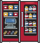
Six detailed illustrations distinguish the offer at a glance, from classic vending and micro markets to coffee, snacks and drinks. Shared curves and proportions keep the set related without sacrificing clarity.
A more reduced set identifies the environments served, including offices, apartments, hospitals, schools and gyms. The simple silhouettes remain legible at small sizes.
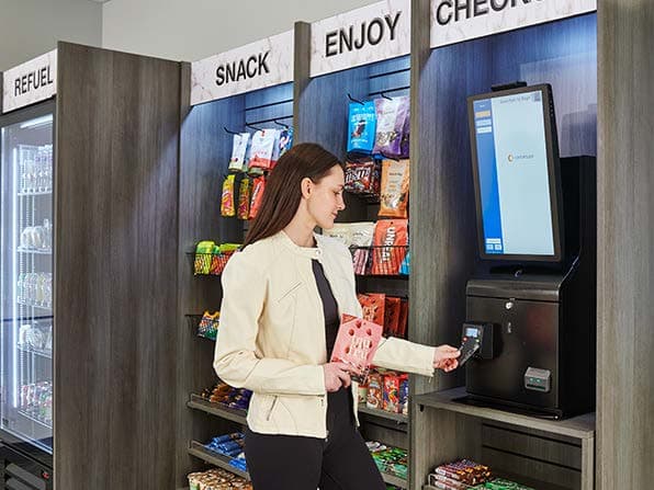
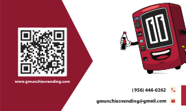
Burgundy creates an immediate impression, while the mascot adds warmth. Contact details and the QR code stay easy to find, balancing personality with utility.
Project Outcome
Client Review
I loved both the website and the complete branding system. The website is incredibly fast and has a strong SEO foundation. I also appreciated Nikola's help with establishing the business's presence on Google and getting everything ready for launch.
Guillermo Guerrero, Gmunchies Vending
My Reflection
The client gave me room to think beyond a single deliverable. Bringing strategy, illustration, digital design and launch support together made the project especially rewarding, and the result gives the business room to grow.
Nikola Dolovski
More work